In the previous article, we’ve discovered an overview of the Silverlight application built to edit levels for the XNA game. Let’s now analyze how I’ve built it and which are the interesting Silverlight features inside it.
Note : you’ll find the complete final source code of the Silverlight application demonstrated in the previous article to download at the end of this blog post. I’ve tried to add as much documentation as possible. Comments in the code and this article should then be fairly complementary.
First tests and architecture errors
Since the beginning, I had a very clear idea of the look & feel my Silverlight Level Editor should have. Some blocks on the left, a main design surface area on the center and the list of loaded levels as well as the available actions on the right. I was first hesitating letting the user designing the level by drag’n’dropping the blocks on the design surface but after some first experimental tests, I just found out that this kind of user experience was just awful. Still, I had 2 main problems to solve:
1 – How will I build the level design surface? From an existing control? Building my own control?
2 – How will I generate the thumbnails of the levels loaded and displayed in the ListBox on the right?
I’m then going to tell you the story of my experiments and mistakes. I hope that this story will be useful for you to avoid doing the same mistakes (of course, those mistakes were made intentionally just for educational purposes… ;-))
Experiments done for the Level Editor control
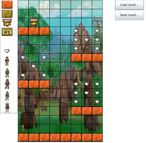
I’ve started working on the first problem by being lazy and by trying building a rapid prototype. For me, the level editor was simply displaying elements with X columns and Y rows and a DataGrid control was looking like that. The first version I’ve built was then using this idea by modifying the DataGrid control that will welcome my nice level blocks. Here is a screenshot of this first version:
And here is the code to download if you’d like to review this bad first approach:
To build this version, I just had to modify with Expression Blend the style of the DataGrid to change the way it was displaying the current line selected and the current cell selected. Moreover, I was hard-coding the number of rows and columns to format the DataGrid control for the structure of the XNA game level. 8 columns and 16 rows are needed for instance for the Windows Phone 7 version.
However, I quickly end to these thoughts:
– How dynamically change this approach to load other type of platform levels like those from the Xbox 360/PC that need a different number of rows/columns?
– The “line by line” logic of the DataGrid control wasn’t really designed for my needs with the level editor. Moreover, this control embeds a lot of useless logic for my level editor.
Ok, let’s then try to think for a couple of seconds and use a better approach. What do we need on a functional point of view? An in-memory collection of elements (for my blocks/cells), a selectable element to be able to change it by other one during the design process and finally an event that will inform us that an element has changed. Well, there is already a control providing this logic: it’s named the ListBox control.
Ok good, why not. But… this control doesn’t display the elements in the form of a grid, does it? No, that’s true but this is not a problem. We’re going to ask it to change his behavior.
For that, we’re going to use the magic of the Sivlerlight templating engine. I’ve then used a ListBox control where I’ve changed its ItemsPanelTemplate to be able to finally draw the elements in another way: through a Grid control.
Here is the piece of XAML that enables this change:
<ListBox x:Name="ListBoxDesignSurface"
            ItemsSource="{Binding}"
            Background="Transparent"
            SelectionChanged="DrawSelectedBlock"
            LayoutUpdated="ListBoxDesignSurface_LayoutUpdated">
    <ListBox.ItemTemplate>
        <DataTemplate>
            <local:BlockCell />
        </DataTemplate>
    </ListBox.ItemTemplate>
    <ListBox.ItemsPanel>
        <ItemsPanelTemplate>
            <Grid ShowGridLines="False" Loaded="FirstFormatDesignSurface" />
        </ItemsPanelTemplate>
    </ListBox.ItemsPanel>
</ListBox>
We’re indicating here that each element of the ListBox will now be a BlockCell UserControl (thanks to the redefinition of the ItemTemplate). Then, we’re also indicating that the elements won’t be displayed anymore vertically like a basic ListBox but through a Grid control. In a general manner, this is how we should think when we’re developing using WPF or Silverlight: what are my functional needs and is there an existing control from the framework/toolkit matching these needs. After that, the visual aspect can be easily modified through the XAML with Blend for instance.
My BlockCell control is simply a UserControl containing an Image control that will display the corresponding level block. We’re now missing one final step to make this works: distributing all the cells of my ListBox collection in the different cells of my Grid control.
However, compared to WPF like in this Mitsu’s French article, doing that in Silverlight is a litte more complex for 2 reasons:
1 – We don’t have the support of the ItemContainerStyle property, we will then have to find the ItemContainer through a specific helper
2 – We can’t do some binding in the XAML on the column & row attached properties
To go over these limitations, in the Loaded event of the BlockCell control, we’re executing the following code:
private void UserControl_Loaded(object sender, RoutedEventArgs e)
{
    var presenter = this.GetVisualParent<ListBoxItem>();
    presenter.SetBinding(Grid.RowProperty, new Binding("Y"));
    presenter.SetBinding(Grid.ColumnProperty, new Binding("X"));
    Visibility = System.Windows.Visibility.Visible;
}
Thanks to the GetVisualParent<T>() method, we get a pointer to the instance of the ListBoxItem element containing our BlockCell element and we’re setting on it via binding the desired position in the columns and rows of the grid.
In order to have this code working fine, we need 2 more things:
1 – Defining in our CellViewModel used as the source of the BlockCell control the X & Y properties that will be used as binding properties:
public class CellViewModel : INotifyPropertyChanged
{
    public int X { get; set; }
    public int Y { get; set; }

    private string imageUrl;
    private char typeOfBlock;

    public CellViewModel(char _varTypeOfBlock) : this(_varTypeOfBlock, 0,0)
    { }

    public CellViewModel(char _varTypeOfBlock, int _X, int _Y)
    {
        #region SwitchImageTypeOfBlock
        switch (_varTypeOfBlock)
        {
            case Constants.EMPTYBLOCK:
                this.ImageUrl = @"Content/Tiles/Empty.png";
                break;
            case Constants.BLOCKA:
                this.ImageUrl = @"Content/Tiles/BlockA0.png";
                break;
        ...
        }
        #endregion

        this.TypeOfBlock = _varTypeOfBlock;
        this.X = _X;
        this.Y = _Y;
        this.IsAvailable = Visibility.Visible;
    }

    public string ImageUrl
    {
        get { ... }
        set { ... }
    }
    public char TypeOfBlock
    {
        get { ... }
        set { ... }
    }

    #region  INotifyPropertyChanged Members
    ...
    #endregion
}
2 – Providing the helper that will allow the navigation into the Visual Tree to find back the element of type ListBoxItem to apply the binding on it. For that, Mitsu helped me and even published an article on this topic: http://blogs.msdn.com/b/mitsu/archive/2010/06/18/some-basic-sample-to-make-your-code-linq-ready.aspx . In my case, here is the code I’ve used:
public static class MyDependencyObjectExtensions
{
    public static IEnumerable<DependencyObject> GetVisualParents(this DependencyObject source)
    {
        do
        {
            source = VisualTreeHelper.GetParent(source);
            if (source != null)
                yield return source;
        } while (source != null);
    }
    public static T GetVisualParent<T>(this DependencyObject source) where T : class
    {
        return source.GetVisualParent<T>(0);
    }
    public static T GetVisualParent<T>(this DependencyObject source, int level) where T : class
    {
        return source.GetVisualParents().OfType<T>().Skip(level).FirstOrDefault();
    }
}
Note : I’m getting registered to the Loaded event of the Grid control used inside the ItemsPanelTemplate in order to be able to get its instance. Once the instance get, I’m formatting the grid control dynamically by code to set the proper columns & rows definitions. I’m then more flexible to changes if I need to edit levels from another platform (as the Xbox 360 or PC).
Thumbnails generation of the loaded levels
My first idea was to use a new feature that shipped with Silverlight 3: the WriteableBitmap. We can indeed generate some kind of screenshots inside a Bitmap image of a specific control or specific part of the Visual Tree of Silverlight. I then simply thought that I will generate some screenshots of my levels once loaded and display the output image in the ListBox displaying all the level loaded. Furthermore, when the user will click on the level editor control to modify a cell, I will generate again a new screenshot to modify the thumbnails used in the ListBox.
Unfortunately, finding when Silverlight has completely finished his drawing job of my level editor control is not an easy task. Indeed, the Loaded event is raised to early. If I’m doing my screenshot here, the control hasn’t finished applying the ItemsPanel templating yet… We have the LayoutUpdated event that seems to be a bit more useful but it’s not so much friendlier for this task. The only solution I’ve found used in this event was by counting the number of times I was called inside to try to find out at which proper time I should generate my thumbnail…
This article is globally describing my problem: http://blogs.msdn.com/b/silverlight_sdk/archive/2008/10/24/loaded-event-timing-in-silverlight.aspx
Well, I’ve finally ended up writing this code and I must admit I’m not very proud of it:
private void ListBoxDesignSurface_LayoutUpdated(object sender, EventArgs e)
{
    // If a new level has just been loaded, we need to detect
    // the proper timing to generate the snapshop/thumbnail
    if (NewLevelLoaded)
    {
        LayoutPass++;

        // The good timing seems to be after 2 passes
        if (LayoutPass == 2)
        {
            currentLoadedLevel.Thumbnail = new WriteableBitmap(SimulatedScreen, null);
            levels.Add(currentLoadedLevel);
            LayoutPass = 0;
            NewLevelLoaded = false;
        }
    }

    if (NewCellAdded)
    {
        if (currentLoadedLevel != null)
        {
            LayoutPass++;

            // The good timing seems to be after 3 passes
            if (LayoutPass == 3)
            {
                currentLoadedLevel.Thumbnail = new WriteableBitmap(SimulatedScreen, null);
                LayoutPass = 0;
                NewCellAdded = false;
            }
        }
        else
        {
            NewCellAdded = false;
        }
    }
}
The solution that matches this level of my experiments can be downloaded here:
2 problems:
1 – This code is really dirty and I don’t like this approach (well, anyway, I could still have lived with that ;-))
2 – When you’re drag’n’dropping several files, my code ends up into a pseudo-multithreaded context that completely breaks my weak logic code that checks the number of passes in the LayoutUpdated event. A solution could be to prevent loading several files during the drag’n’drop operation and only load the first one for instance. But this would have been a pitful solution.
The final solution to resolve all my needs/problems I’m sharing with you since the beginning of this article will then be to build a “real” control that will be used also in the ListBox displaying the levels with their thumbnails. Then, thanks to the bidirectional binding, the update of the main level editor control will automatically update the thumbnail version in the ListBox without having to use the WriteableBitmap approach.
The LevelEditor control
The LevelEditor control simply encapsulates the logic described before by using a ListBox control as a base. Here is for instance an extract for the code used:
public class LevelEditor : ListBox
{
    // Pointer to the Grid contained inside the ItemsPanel template of the ListBox
    // used to display/design a level
    private Grid itemsPanelGrid = null;

    public int ColumnsCount
    {
        get { return (int)GetValue(ColumnsCountProperty); }
        set { SetValue(ColumnsCountProperty, value); }
    }

    // Using a DependencyProperty as the backing store for ColumnsCountProperty.  This enables animation, styling, binding, etc...
    public static readonly DependencyProperty ColumnsCountProperty =
        DependencyProperty.Register("ColumnsCountProperty", typeof(int), typeof(LevelEditor), new PropertyMetadata(0, new PropertyChangedCallback(ColumnsCountChangedCallback)));

    public static void ColumnsCountChangedCallback(DependencyObject d, DependencyPropertyChangedEventArgs e)
    {
        (d as LevelEditor).OnColumnsCountChanged(e);
    }
    protected virtual void OnColumnsCountChanged(DependencyPropertyChangedEventArgs e)
    {
        UpdateGrid();
    }

    ...

    public void UpdateGrid()
    {
        if ((RowsCount != 0) && (ColumnsCount != 0) && (ItemsPanel != null))
        {
            // Searching the visual tree to find the Grid used for the ItemsPanel template
            if (itemsPanelGrid == null)
                itemsPanelGrid =
                    this.FindVisualChildren<Grid>()
                        .Where(g => g.Name == "itemsPanelGrid").FirstOrDefault();
            FormatDesignSurface(itemsPanelGrid);
        }
    }

    public LevelEditor()
    {
        base.Loaded += new RoutedEventHandler(LevelEditor_Loaded);
        this.DefaultStyleKey = typeof(LevelEditor);
    }

    void LevelEditor_Loaded(object sender, RoutedEventArgs e)
    {
        UpdateGrid();
    }

    // Called to reformat the grid based on the values
    // matching the targeted platform (Xbox/PC ou WP7)
    public void FormatDesignSurface(Grid grid)
    {
        if (grid != null)
        {
            grid.ColumnDefinitions.Clear();
            grid.RowDefinitions.Clear();

            double CellsWidth = ActualWidth / ColumnsCount;
            double CellsHeight = ActualHeight / RowsCount;

            for (int x = 0; x < ColumnsCount; x++)
            {
                ColumnDefinition column = new ColumnDefinition();
                column.Width = new System.Windows.GridLength(CellsWidth);

                grid.ColumnDefinitions.Add(column);
            }

            for (int y = 0; y < RowsCount; y++)
            {
                RowDefinition row = new RowDefinition();
                row.Height = new System.Windows.GridLength(CellsHeight);
                grid.RowDefinitions.Add(row);
            }
        }
    }
}
There are 2 dependency properties which are handling the number of columns and rows. When one of these values are changed by a binding operation, we automatically call the FormatDesignSurface() method which reformat the grid control with the proper columns & rows definitions. Ok, but there is still a final problem. How to retrieve the instance of the Grid control used inside the ItemsPanelTemplate setting? Indeed, the templates modifications of the ListBox are done by styling inside a “real” control:
<Style TargetType="local:LevelEditor">
<Setter Property="ItemTemplate">
    <Setter.Value>
        <DataTemplate>
            <local:BlockCell />
        </DataTemplate>
    </Setter.Value>
</Setter>
<Setter Property="ItemsPanel">
    <Setter.Value>
    <ItemsPanelTemplate>
        <Grid ShowGridLines="False" x:Name="itemsPanelGrid">
            <Grid.Effect>
                <DropShadowEffect ShadowDepth="10" />
            </Grid.Effect>
        </Grid>
    </ItemsPanelTemplate>
    </Setter.Value>
</Setter>

<Setter Property="Template">
    <Setter.Value>
        <ControlTemplate TargetType="ListBox">
            <Grid>
                <Border BorderBrush="{TemplateBinding BorderBrush}" BorderThickness="{TemplateBinding BorderThickness}" CornerRadius="2">
                    <ScrollViewer x:Name="ScrollViewer" BorderBrush="Transparent" BorderThickness="0" Background="{TemplateBinding Background}" Padding="{TemplateBinding Padding}" TabNavigation="{TemplateBinding TabNavigation}">
                        <ItemsPresenter/>
                    </ScrollViewer>
                </Border>
            </Grid>
        </ControlTemplate>
    </Setter.Value>
</Setter>
</Style>
Thus, registering to the Loaded event into a style would make no sense. We then need to retrieve the Grid instance by navigating again in the Visual Tree using another helper named FindVisualChildren():
public static IEnumerable<T> FindVisualChildren<T>(this DependencyObject obj) where T : DependencyObject
{
    // Search immediate children
    for (int i = 0; i < VisualTreeHelper.GetChildrenCount(obj); i++)
    {
        var child = VisualTreeHelper.GetChild(obj, i);

        if (child != null)
        {
            if (child is T)
                yield return child as T;
            foreach (var childOfChild in FindVisualChildren<T>(child))
                yield return childOfChild;
        }
    }
}
And that’s it! We can now use this control on the center of the application as the main design area and use the very same control to display the thumbnails in the ListBox. To display the thumbnail, the simplest way was to use the Viewbox control embedding the LevelEditor control in the ListBox ItemTemplate to easily change the visual output. Here is then the XAML ListBox definition of the loaded levels:
<!-- Listbox with the loaded level displaying them via thumbnails, binding source of the main editor -->
<ListBox Height="520" x:Name="lstLoadedLevels"
    Width="125" Margin="0,20,35,0"
    HorizontalContentAlignment="Center"
    VerticalContentAlignment="Center"
    ScrollViewer.VerticalScrollBarVisibility="Visible"
    SelectionChanged="lstLoadedLevels_SelectionChanged"
    <ListBox.ItemTemplate>
        <DataTemplate>
            <Viewbox Height="160" Width="96">
                <Grid>
                    <local:LevelEditor
                    IsEnabled="False"
                    Height="800" Width="480"
                    RowsCount="16" ColumnsCount="8"
                    ItemsSource="{Binding Cells}">
                        <local:LevelEditor.Background>
                            <ImageBrush ImageSource="Content/Backgrounds/SampleBackgroundLayer.png" />
                        </local:LevelEditor.Background>
                    </local:LevelEditor>
                    <TextBlock Text="{Binding Name}" FontSize="60" HorizontalAlignment="Right" VerticalAlignment="Top"/>
                </Grid>
            </Viewbox>
        </DataTemplate>
    </ListBox.ItemTemplate>
And here is the XAML definition of the main level editor area:
<!-- Main level editor on the center of the screen
    bound to the current level selected in the right listbox
-->
<local:LevelEditor x:Name="MainLevelEditor"
    Margin="10,0,0,0"
    RowsCount="16" ColumnsCount="8"
    Width="480" Height="800"
    ItemsSource="{Binding SelectedItem.Cells, ElementName=lstLoadedLevels, Mode=TwoWay}"
    SelectionChanged="MainLevelEditor_SelectionChanged">
    <local:LevelEditor.Background>
        <ImageBrush ImageSource="Content/Backgrounds/SampleBackgroundLayer.png" />
    </local:LevelEditor.Background>
</local:LevelEditor>
This one is simply bound to the current selected element of the ListBox as you can see with the line in bold.
Specific Silverlight 4 features used
As you’ve seen in the overview video available in the previous article, the Silverlight application supports drag’n’drop operation of *.txt files containing the levels, right clicking on the ListBox elements displaying a contextual menu on the loaded levels and the new Fluid UI animations very easy to implement with Expression Blend 4 for instance. I’ve also used a Viewbox control to embed the complete window of my application to support dynamic resizing with no effort! As you can already find a lot of resources on the web on these topics, I won’t go deeper in the implementation details of these features in this application.
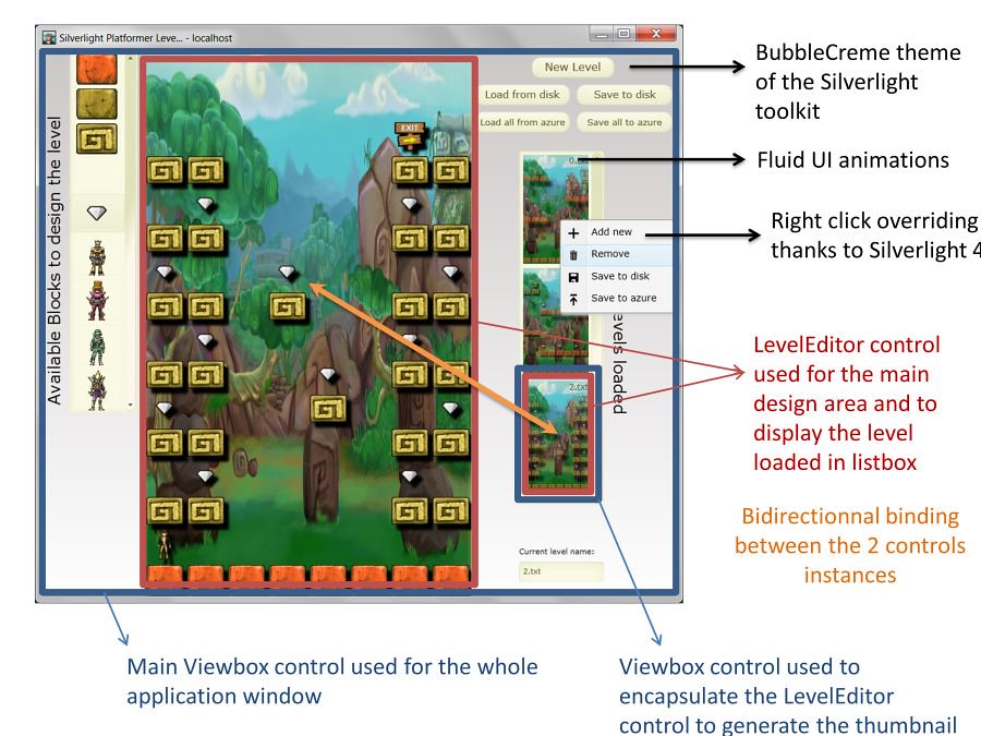
Anatomy of the final application
Bonus level
Only for pure fun, here is a little code writing optimization that a Japanese LINQ fan suggested me. My first initial code to load a new empty level was this one:
private void LoadEmptyLevelOldStyle()
{
    ObservableCollection<CellViewModel> newCells = new ObservableCollection<CellViewModel>();

    for (int y = 0; y < RowsNumber; y++)
    {
        for (int x = 0; x < ColumnsNumber; x++)
        {
            newCells.Add(new CellViewModel(Constants.EMPTYBLOCK, x, y));
        }
    }

    currentLevel = new LevelViewModel(newCells, "new" + NewLevelIndex);
    loadedLevels.Add(currentLevel);
    NewLevelIndex++;
}
But honestly, who is still using a double for loop for such things in 2010?!? Here is then a more modern way to write the same code:
private void LoadEmptyLevelModernStyle()
{
    // Equivalent of a double for loop thanks to LINQ!
    var qGenerateCells =
        from y in Enumerable.Range(0, RowsNumber)
        from x in Enumerable.Range(0, ColumnsNumber)
        select new CellViewModel(Constants.EMPTYBLOCK, x, y);

    ObservableCollection<CellViewModel> newCells = new ObservableCollection<CellViewModel>(qGenerateCells);

    currentLevel = new LevelViewModel(newCells, "new" + NewLevelIndex);
    loadedLevels.Add(currentLevel);
    NewLevelIndex++;
}
The LINQ request is building an expression tree that will be stored in the qGeneratedCells. As the ObservableCollection constructor accepts IEnumerable, we then pass the LINQ expression tree to the constructor as a parameter. This will then finally build our collection of empty cells for our level. The LINQ request is then executed only during the new operation on the ObservableCollection type.
Final code available for download
Here is the final Visual Studio 2010 solution to download:
And here is a list of useful resources which helped me building this Silverlight application:
– Mitsuru Furuta himself 🙂
– Mitsu’s blog: http://blogs.msdn.com/b/mitsu/archive/2010/06/18/some-basic-sample-to-make-your-code-linq-ready.aspx and a French Mitsu’s article on WPF : http://msdn.microsoft.com/fr-fr/dd787685.aspx he helped me to update for Silverlight 4
– WP7 icons: http://www.microsoft.com/downloads/details.aspx?FamilyID=369b20f7-9d30-4cff-8a1b-f80901b2da93&displaylang=en used in the contextual menu when the user right clicks on the listbox
We’ll now see in the next article the details part on the way I’ve handled the Azure Blob Storage.
David
Freaking AWSOME man! Going to try and port this to WPF somehow. Thanks for all the pictures too. It makes it easier to follow.
Excellent article David. Keep it up.