We have delivered a 2 days training in France around Accessibility. One slot of these 2 days was dedicated to Silverlight. As accessibility is something really important in building RIA applications, here is the complete lab to follow if you’d like to better understand how to build accessible Silverlight applications.
You can download the very same instructions in a Word Document format as well as the Visual Studio solutions to work with during this lab here :
Estimated time to complete this lab : 60 minutes
Objectives
The objective of this lab is to learn about how you can build accessible UI with Silverlight.
After completing this lab, you will be able to:
· Understand how Silverlight offer ready to use accessible controls.
· Take care of basic accessibility principles like high contrast or zooming with Silverlight applications
Important Note: The exercises in this lab are intended to provide an overview of the technology presented. They are not intended to, and may not follow, Microsoft best practices or guidance on the technologies presented.
Prerequisites
You’ll need Visual Studio 2010 or Visual Web Developer Express 2010 with the Silverlight Tools installed to follow this lab. You can use Web Platform Installer to setup your machine: http://www.microsoft.com/web/downloads/platform.aspx
Getting Started
The Hands-On Lab files available in the above ZIP archive to download contains a number of additional resources.
This lab includes the following additional resources:
| The Lab Manual | HOL – Making Silverlight Applications Accessible.docx | Equivalent of this blog post |
| Source CodeDC01 | Before Exercice1.Task1 After Exercice1.Task1DC01 |
Lab exercise 1 source code Completed lab exercise 1 source code |
This lab is mainly based on this excellent article: http://www.silverlight.net/learn/quickstarts/accessibility/ .
Exercise 1 – Keyboard Support
Estimated time to complete this exercise: 30 minutes
To provide good keyboard support, you must ensure that every part of your application can be used with a keyboard. If your application makes heavy use of the standard controls, you are most of the way there already. The Silverlight control library provides built-in keyboard support including tab navigation, text input, and control-specific support such as arrow key navigation among ListBox items and DataGrid cells.
In this exercise, you will:
1. Add Tab Navigation
2. Add Keyboard Alternatives to Mouse Events
3. Handle Shortcut Keys and set the focus to the Silverlight Plug-in
Task 1 – Adding Tab Navigation support
To use the keyboard with a control, it must have input focus, and to receive input focus (without using the mouse), it must be accessible via tab navigation. By default, the tab order of controls is the same as the order in which they are added to a design surface, listed in XAML, or programmatically added to a container.
In most cases, the default order is the best order, especially because that is the order in which the controls are read by screen readers. However, the default order does not necessarily correspond to the visual order. The actual display position depends on the containing Panel and the values of properties such as Margin, Canvas.Top and Canvas.Left, or Grid.Row and Grid.Column.
You can ensure that the tab order matches the visual order by adjusting the XAML, or you can override the default tab order by setting the TabIndex property, as shown in the following example of a Grid layout that uses column-first tab navigation.
Perform the following tasks:
1. Open the initial VS2010 project named “Exercice1.Task1” available in the “Before” folder. Launch it and see how you can navigate into the controls using the Tab key.
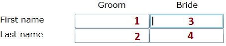
2. Using the TabIndex property on each TextBox control, change the default way to navigate to match this order :
Tab navigation cycles through all controls in both the browser host and the application, and then repeats the cycle from the beginning. Users can navigate backward through the tab order by pressing SHIFT+TAB.
If you want to exclude a control from the tab order, you can set the IsTabStop property to false. However, you will typically do this only if you make a control non-interactive, for example by setting its IsEnabled property to false, which automatically excludes it from the tab order.
3. Solution is available in the “After” folder
Task 2 – Adding Keyboard alternatives to mouse events
If you implement any mouse-specific interactions, you should implement keyboard equivalents. However, in order to use the keyboard with a UI element, the element must have input focus. Only classes that derive from Control support input focus and tab navigation.
You could create your own custom control, in which case you must set the IsTabStop property to true to enable input focus and provide a visual indication of the focused state using the VisualStateManager class. However, it is often easier to make use of Silverlight control composition.
Perform the following tasks:
1. Open the initial VS2010 project named “Exercice1.Task2” available in the “Before” folder. Launch it and see that you can only throw the click event with the mouse. Moreover, you can’t navigate via the Tab key through the controls.
2. Instead of handling a mouse event on an Image, you could wrap it in a Button to get mouse, keyboard, and focus support automatically. Modify the 2 elements to do so. For instance, modify the following piece of XAML:
<StackPanel>
    <Image x:Name="btn1" Source="Images/datagrid.png" Width="29" Height="32"  />
    <TextBlock Style="{StaticResource MenuLabel}" Text="Table"/>
    <ToolTipService.ToolTip>
        <ToolTip FontSize="16" Content="Insert table"/>
    </ToolTipService.ToolTip>
</StackPanel>
By :
<Button x:Name="btn1" Grid.Column="2" Grid.RowSpan="1" Margin="20,10,10,10"
        HorizontalAlignment="Left" Grid.Row="1" Click="TableClick">
    <StackPanel>
        <Image  Source="Images/datagrid.png" Width="29" Height="32" />
        <TextBlock Style="{StaticResource MenuLabel}" Text="Table"/>
        <ToolTipService.ToolTip>
            <ToolTip FontSize="16" Content="Insert table"/>
        </ToolTipService.ToolTip>
    </StackPanel>
</Button>
3. Do the same modification on the second StackPanel to embed it inside another button.
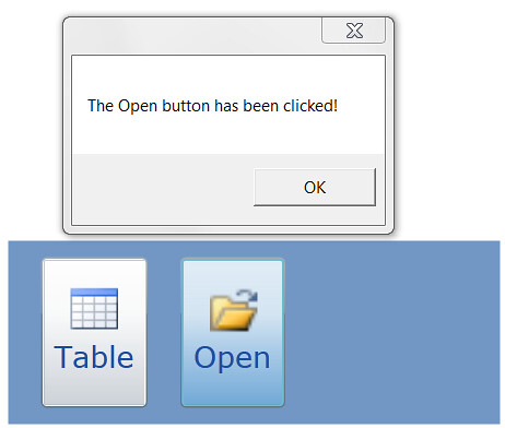
4. Launch the project. You should now be able to navigate on the controls using the Tab key and call the click event using the Space key :
Your Silverlight application is now accessible with the keyboard.
5. To go a step further, you can emphasis where the user has clicked by adding specific contrast to the element. For instance, add to the following style to both buttons :
Style=”{StaticResource ToolBarButtons}”
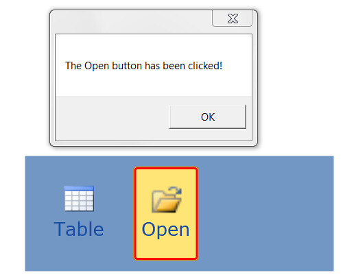
6. Relaunch your Silverlight application and notice the difference when you’re clicking on one of the buttons :
7. Have a look to the App.xaml file to find where this style is defined. The change states are handled by the VisualStateManager. This is very important to work with it while building Accessible Silverlight applications. That’s why you should always try to start from core Silverlight controls already providing the default states to use.
8. Try changing the red rectangle by a green rectangle when the button is pressed.
9. You’ll find the final solution on the “After” folder.
Task 3 – Adding Shortcut Keys
Tab navigation provides a good, basic level of keyboard support, but with complex forms, you might want to add support for shortcut keys as well. This can make your application more efficient to use, even for people who use both a keyboard and a mouse.
Silverlight does not provide the kind of built-in shortcut key support that you find in Windows Presentation Foundation (WPF) or Windows Forms. One issue with shortcut keys in Silverlight is that many key combinations are intercepted by the browser host or operating system. Additionally, browser updates can add new shortcut keys at any time, creating unanticipated future conflicts.
It is possible to implement your own shortcut key support, but you should test shortcut keys in all supported browsers. To avoid conflicts, you should not use modifier keys such as CTRL, SHIFT, and ALT. However, in some cases, such as data-entry applications, this is not practical.
If you require modifier keys, one option is to require out-of-browser installation, although even in this case, you cannot use the ALT key. Another option is to use keystrokes that are less likely to cause conflict, such as number keys in combination with CTRL+SHIFT. Using number keys is also beneficial to avoid potential issues with language-dependent letter keys in localized applications.
It is important to document the shortcut keys in your application so that users are aware of them. For example, you can provide a ToolTip on a button that has a shortcut key. You can also use the convention of underlining a letter in a control label. This kind of shortcut key is called an access key or mnemonic. Of course, ToolTips are not useful without a mouse, and neither ToolTips nor underlined letters are reported by screen readers.
You can document access keys through screen readers by setting the AutomationProperties.AccessKey attached property to a string that describes the shortcut key. There is also an AutomationProperties.AcceleratorKey attached property for documenting non-mnemonic shortcut keys, although screen readers generally treat both properties the same way. In general, you should document shortcut keys in multiple ways, using ToolTips, automation properties, and written help documentation.
Perform the following tasks:
1. Open the initial VS2010 project named “Exercice1.Task3” available in the “Before” folder or continue on your project built during the Task2.
2. We’re going to map to T key to the insert table action and the O key to the open file action. For that, set the following property :
AutomationProperties.AccessKey
On both buttons.
3. You need to tell to the user also which key is used for each action. There are 2 good things to do for that: adding an underline on the appropriate character and document it inside the tooltip. Use this piece of XAML to reflect these changes in your application :
<TextBlock Style="{StaticResource MenuLabel}"><Underline>T</Underline>able</TextBlock>
<ToolTipService.ToolTip>
    <ToolTip FontSize="16" Content="Insert table - Shortcut Key: T"/>
</ToolTipService.ToolTip>
4. Do the same for the second button and launch your application. You will then be able to simulate the click by pressing the ‘T’ and ‘O’ keys. However, you have maybe seen that you need to provide the focus to the Silverlight application first.
5. Indeed, another issue with shortcut keys in Silverlight is that Silverlight cannot receive any keystrokes unless the Silverlight plug-in itself has input focus. If the Silverlight plug-in is only part of a web page that has other content, users will need to tab to or click the plug-in before they can use the keyboard with it. If the plug-in occupies the entire page, however, you can add the following code to ensure that the plug-in receives focus as soon as the page finishes loading :
LayoutRoot.Loaded += (sender, e) => System.Windows.Browser.HtmlPage.Plugin.Focus();
6. If you launch your application after adding this code, you’ll see that you will be able to immediately use the shortcut keys as now the Silverlight application get the focus by default.
7. You’ll find the solution in the “After” folder as usual.
Exercise 2 – Screen Reader Support
Estimated time to complete this exercise: 10 minutes
Screen readers provide access to the text in an application by rendering it some other format, such as spoken language or Braille output. The exact behavior of a screen reader depends on the software and on the user configuration of the software.
For example, some screen readers read the entire application UI when the user launches or switches to the application, enabling the user to receive all of the available informational content before using tab navigation. Some screen readers also read the text associated with an individual control when it receives input focus during tab navigation. This enables users to orient themselves as they navigate among the input controls of an application. Narrator is an example of a screen reader that uses both behaviors.
On the other hand, some screen readers read the text of an application only during tab navigation. For this reason, you should ensure that all important information in your UI is part of a focusable control. For example, instead of using a TextBlock to convey application instructions in your UI, you might use a TextBox or RichTextBox with an IsReadOnly property value of true. This enables the control to receive focus while preventing user input.
In this exercise, you will:
1. Add support for screen reader
Task 1 – Adding support for screen reader
To support screen readers, you must provide text alternatives to non-textual information in the UI, such as images and charts, excluding any purely decorative or structural elements. You can do this by setting the AutomationProperties.Name attached property
Perform the following tasks:
1. Open the initial VS2010 project named “Exercice2.Task1” available in the “Before” folder. Launch it the application.
2. Launch the narrator by clicking on the Start button of Windows 7 and search for the “Narrator” application.
3. Set the focus on the buttons and listen to what the narrator says. It will say “Tabulation, Button under Silverlight control”. The user has no way to know what the purpose of the button is. He just knows this is a Silverlight button.
4. Switch back to the code and set the value of AutomationProperties.Name attached property to each button with “Insert Table” and “Open File”.
5. Launch the application and use the narrator again. Now, it should say “Insert Table Button” and “Open File Button” when you navigate on the 2 buttons using the keyboard.
6. You’ll find the solution in the “After” folder as usual.
Exercise 3 – User Display Settings
Estimated time to complete this exercise: 20 minutes
Users can adjust some display settings at the operating system level or in the host browser. Some of these settings automatically affect Silverlight, while others require some additional work or separate implementation.
Users prefer to configure their display settings at a global level rather than figuring out how to adjust each individual application, so it is a good idea to take advantage of global settings whenever possible. In some cases, however, you will want to provide additional support, and Silverlight enables you to implement arbitrary display customizability that has no relationship to operating system or browser settings.
In this exercise, you will:
1. Know how to dynamically change the size of elements and of the fonts
2. Know how to handle the high contrast mode
Task 1 – Size Settings
Adjusting display sizes at the operating system level affects everything displayed on the monitor, including all Silverlight-based applications both inside and outside the browser.
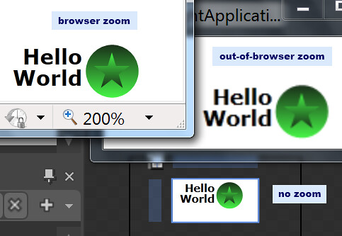
Outside the browser, increased size settings result in fuzziness and pixelization. Inside the browser, display size settings affect the browser zoom setting (for browsers that support zoom settings), which results a smooth, vector-based scaling of browser-hosted Silverlight applications. The following illustration shows the difference between browser zoom and out-of-browser zoom.
In browsers that support zoom settings, users can set the browser zoom level independently of the operating system display settings. In this case, however, out-of-browser applications are not affected.
For Silverlight-based applications hosted in the browser, you can customize the effect of the browser zoom setting by using the Settings.EnableAutoZoom and Content.ZoomFactor properties and the Content.Zoomed event. This is useful for making dynamic layout adjustments.
You can also implement your own display size settings that works regardless of operating system and browser settings. Browser text size settings have no effect on Silverlight, so implementing your own approach is necessary if you want to scale text independently of other UI elements.
Perform the following tasks:
1. Open the initial VS2010 project named “Exercice3.Task1” available in the “Before” folder. Launch the application to see what it does.
2. The aim of this exercise is to change dynamically the size of the user control and the size of the font by using the 2 sliders available. Let’s start by changing the size of the font using the 2nd slider. We’re going to use the element to element binding of Silverlight to do that. Add this property on the UserControl :
FontSize="{Binding Value, ElementName=FontZoomSlider}"
3. Thanks to this code, the FontSize property will be automatically updated based on the value of the FontZoomSlider element. This shows you how to let the user choosing the proper size for him.
4. We’re now going to see how to zoom the complete user control by using a simple transform operation. For that, add this XAML part inside the UserControl:
<UserControl.RenderTransform>
    <ScaleTransform x:Name="transform" CenterX="200"
        ScaleX="{Binding Value, ElementName=UIZoomSlider}"
        ScaleY="{Binding Value, ElementName=UIZoomSlider}"/>
</UserControl.RenderTransform>
5. We’re simply scaling the element using a RenderTransform, playing with the ScaleX & ScaleY properties binded to the UIZoomSlider value.
Task 2 – Color and High Contrast Settings
Many users have difficulty distinguishing certain colors or experience discomfort when viewing UIs with bright colors or insufficient contrast. It is therefore useful to provide the option to change the default colors, or at least to switch to a high contrast mode.
If users select a high contrast setting at the operating system level, your application should respond to it and switch to high contrast mode automatically. You can do this by checking the SystemParameters.HighContrast property when your UI loads. Note, however, that your application cannot automatically detect changes to this property, so it is helpful to provide your own UI in addition to checking the operating system setting.
Another option is to use the System Colors theme provided by the Silverlight Toolkit. This theme automatically applies the current system colors (including high contrast colors) to all of the controls provided by Silverlight and the toolkit. For more information, see the Silverlight Toolkit.
The following example demonstrates how to use the Style class and the SystemParameters.HighContrast property to implement a high contrast mode.
Perform the following tasks:
1. Open the initial VS2010 project named “Exercice3.Task2” available in the “Before” folder. Launch the application to see what it does.
2. The idea here is to change the color and contrast of the controls if the user has set the high contrast mode of Windows or if he’s enabling the checkbox. You’ll notice by looking at the XAML that there are 2 styles currently available. We then need a method that will apply these styles based on the current mode chosen by the user.
Here is the based method for that:
private void SetHighContrast(Boolean highContrast)
{
    if (highContrast)
    {
        ContentBlock.Style =
            this.Resources["ContentBlockHighContrastStyle"] as Style;
        ContentBorder.Style =
            this.Resources["ContentBorderHighContrastStyle"] as Style;
    }
    else
    {
        ContentBlock.Style =
            this.Resources["ContentBlockDefaultStyle"] as Style;
        ContentBorder.Style =
            this.Resources["ContentBorderDefaultStyle"] as Style;
    }
}
3. We now need to call this method during the initialization process of the Silverlight application checking the current contrast mode of Windows. Add this code into the constructor of the MainPage:
if (SystemParameters.HighContrast)
{
    SetHighContrast(true);
    HighContrastCheckBox.IsChecked = true;
}
4. Enable the high contrast mode of Windows (Left Alt + Left Shift + Print Screen) and launch your Silverlight application. The checkbox should be checked and the High Contrast Style should be applied.
5. Last step is to change the style by checking/unchecking the checkbox. You can use this piece of code for that:
private void HighContrastCheckBox_Click(object sender, RoutedEventArgs e)
{
    SetHighContrast(HighContrastCheckBox.IsChecked.Value);
}
6. If you want to see how far you can go on this topic, open the solution in the “After” folder named “Exercice3.Task2.SLToolkit” and check out the available “Basic Theme” that works well with the high contrast mode of Windows.
Others ressources
– MIX09 & MIX10 Sessions :
– Building Accessible RIAs in Microsoft Silverlight
– CL51- Building an Accessible Microsoft Silverlight Experience and you can download the presentation here.
– Silverlight Accessibility Issues and Proposed Guidelines by Hitachi : http://www.hitachi.co.jp/universaldesign/silverlight/en/guideline.html
– Making Silverlight Applications Accessible : http://www.silverlight.net/learn/quickstarts/accessibility/
David
very nice post, will try to use some of those tips at ClipFlair Studio (http://studio.clipflair.net)